Monday, May 2, 2011

just the seeds added.....to the Strawberries


I have not gotten to paint for the last few days, but I just could not look at these strawberries any longer without seeds. So on the first attempt I added lots, way too many. So I wiped out, since the painting was dry, and tried again. I just wanted to suggest seeds without defining the whole lot. Much improved, I think. Also, the painting a few posts back with my brushes and apples....well, I switched the painting. Usually I don't like to go back in and rework after I've declared "done". I have ruined more paintings that way without the ability to edit it back to the way it was. I only have a memory through a photo image. I also have photos of a few "could have beens" if I just had not been so hasty in wiping out.


This painting, I think in looking back, had a really good start...and I wiped it out. The setup was placed on a piece of white acrylic, so I could get some interesting reflections to paint. I had never done that kind of setup before. Here the dark background really made that vase glow! What was I thinking! Guess I was just afraid of the challenge. 

Friday, April 29, 2011

"Magnolia" 20" x 20" oil on linen


I've always wanted to paint a watercolor or oil palette. This is my little Cotman I sometimes use when I travel. I seem to have lost the little water reserve that goes with it. The magnolia blossom I picked earlier yesterday. Then in the afternoon the skies opened up and the rains came. When the storms were over all the blossoms were on the ground. When I returned to my easel this morning the blossom I had picked was pale and limp, so I had to paint this flower from my memory, which is rather scattered and sparse. I really should go back to watercolors for awhile and take a break from oils. 

Wednesday, April 27, 2011

"My Brushes and Apples" 11" x 14" oil on linen


Today was surprisingly busy just in my back yard. Just tree stuff, but enough interruptions to distract and redirect. I love painting these green apples with this turquoise pitcher. Needs a spot more of red, though. 

Tuesday, April 26, 2011

"Pedestrians" 10" x 10" oil on linen


 I've felt rather disconnected lately. There is just so much going on with not enough time to get it all completed. And now it is about grass cutting season. Yes, I cut my own grass, but only with music in my ears. Well, spring is definitely here, as there is a green haze in the trees....almost leaves. My little grandson, Max, is turning one in a few weeks, so I bought these Waldorf cars for him in a rainbow of colors. So, before I ship them off to him in Germany, I thought I would use two of them in a painting. I should have worked on drawing them for a few hours first! I didn't capture their shape easily. I thought of the orange slices as pedestrians in the middle of this traffic jam, scurrying across the road. I put my "Pink and Green" painting in a show today. Thought I would spend the day outdoors but that did not happen. Driving in the car does not count as being outdoors. I wish I could paint abstract. A painting friend of mine is now painting abstract and her colors and shapes are just beautiful! You can see her work at: lindageorgeart.com
I think this painting is too tight. I usually begin very loose, but somehow lost it in translation.


Wednesday, April 20, 2011

Drawing in your Painting


I'm trying to pay more attention to my drawing in my painting, if that makes sense. I remember when I was in art school majoring in drawing, and the day in class I found that it was not the contour line of the figure or the shading, but some space in between that represented "relationship"  that I saw. Like lost-and-found edges. And this I had the power to control, which was where your eye moved through the drawing. I have always looked at my picture as a way to tell a story by means of a journey with your eyes down a road, up a path or over a bridge......don't quote me on this, but my picture is a map. So, in your composition you are setting up, through shapes, color, value and line a journey. I prefer a pleasant journey and I do this through color harmony, subject matter and value contrasts to name a few. A little tension is good, too. I'm working on the rage thing!

Friday, April 15, 2011

"Scattered" 10" x 10" oil on linen


I feel like I've exhausted my options on things to paint. The last two attempts have been wipeouts after two full days of painting. I tried to do a self portrait with my reflexion bouncing off the light of an old brownie camera flash bowl. Big. Silver. Round. Dull. The next one was a jar of colored pencils with a variety of other things scattered around. No good. Mistakes and failed starts are supposed to be good, I know. That's usually where I do my learning. So I cleaned the inside of my car, which I knew was a guaranteed success. I didn't learn much, but it caused me great pleasure to get into a clean car, start the engine, and move it 20 feet. Ever onward!
This painting, "Scattered", is for sale in my etsy shop at a lower price. Just trying to get that first sale.
http://kathrynglover.etsy.com

Monday, April 11, 2011

"Five Plus One" 10" x 10" Oil on Linen


I'm still on the green apple thing I have going, but strawberries....I don't know. I'm so tempted to eat them. I had, I thought, a real challenge in front of me. I wanted to try to paint really red strawberries, but I just couldn't come up with a pleasing composition. So I actually pulled in the green apple to keep me in my comfort zone, being that I've been painting them a lot lately. I tried to indicate the seeds in the berries, but that was a disaster, so I just kept them "sterile". 

Friday, April 8, 2011

"Just A Spoonful" 10" x 10" oil on linen


Well, today has been rather interesting. I finally went back to my old palette, which is just a piece of thick glass with white paper underneath. What a difference it makes to work with a clean palette! I also did my "thinking hard" session of painting and think that it finally paid off. But I need to be able to pull this off 10 times in a row, with success. There's nothing like being hard on yourself. But if I don't crack the whip, who will? My house is a wreck, it's time to do spring clean-up in the yard and I have recently ignored my vintage etsy shop. Laundry is piling up and no food in the house but cereal...no milk. But I just want to stay off to myself and paint. A gallery contacted me today...they are interested in showing my work. This scares me! I don't do business, but I guess it is time to learn. Can you tell in this painting that the bottle on the left is opaque ...different than the others? That was my problem today; to paint transparent and opaque and be able to tell the difference between the two. I always have to solve a problem when I paint. It takes my mind away from the hard academics of painting.

Thursday, April 7, 2011

"Apple Seltzer" 20" x 20" Oil on Linen


I don't post twice in a day, but I have a little backlog here. This is my third painting of the four with the pink flower.....I really ought to move on now. I love this shape of the seltzer bottle and hope to be using it more in my set ups. I haven't painted successfully green apples before, but these gave me fewer problems......or maybe I'm just finally getting it! The overall value of the apples might work a little lighter, but I'm pleased with the value relationship in each one. When I painted the apple in the back on the left, I remember thinking that I should leave it alone and not mess it up by working on it further, just because it was there, though I was taught that when working on a painting, to work everywhere all the time and not to "finish" up one area. If one area is finished to your liking early, you tend to hold that finished area sacred and will sacrifice other areas of the canvas visually ...like you want the remaining areas to rise up and meet your little sacred piece. I thought of that the entire time I was painting; not to make that back apple sacred. It's very hard to do that; to possibly mess up a well-painted area for the good of the whole.

"A Pair" 8" x 8" Linen on Panel


I bought this new panel yesterday and I like it. This was painted on a panel stretched with a very fine linen on a MFD wood panel and treated with an acid-free primer. Centurion makes the panel in several sizes, but I went straight for the 8" x 8", which is a new size for me. I prefer a square format, always have, but occasionally will use a slight rectangle. I seem to be hung up on this aqua/cool red palette in the last few weeks. This little plastic pitcher is new to my stock. It was made in the 50's or 60's as a promotional giveaway with gasoline. Phillips 66 is printed on the bottom. It's another great find from etsy. I love to mix greens from the blues and yellows on my palette. I use no greens from the tube. 

Wednesday, March 30, 2011

" Pink and Green" 10" x 10" oil on linen


While I have this booty of fresh flowers, I will use them in numerous still life set ups. I just need to keep their water fresh and the ideas flowing. I built a light box in my studio and drape it with a blackout cloth. That way I can control the light on my set up for hours, even as the sun comes through my skylight. I usually do these smaller paintings in one session. Not because it takes a short amount of time, for often it doesn't. I just have to go with the flow and I, fortunately, do not have to break to fix dinners for someone else, especially if I'm not hungry. I'm enjoying working with the cool red on my palette, a welcome change. This red is Permanent Rose( quinacridone) , and makes wonderful purples and violets mixed with cobalt or ultramarine blue.

Monday, March 28, 2011

"Charming" 14" x 11" oil on linen


My day didn't start so well. I had an unpleasant dream that started me down that road of negative thoughts. So the best thing to do is get out of the house. I had 4 purchases from etsy which took a bit of time boxing everything up. Found out at the post office that, once again, I had miscalculated my shipping NOT to my advantage. I need to stop guessing and use the scale I purchased and look everything up on the computer. Then on to Trader Joe's and home. I was determined to paint SOMETHING today, and spending time working on a set-up put me in such a foul mood. I don't enjoy inventing still life set ups at all. Sometimes my execution of the paint is going well, then 3 hours into it, I realize the picture is all wrong. It just isn't balanced or interesting. Today I was thinking of what colors I wanted to use....my palette, dirty as it was, still had some mixing space left...and being too lazy to clean and begin again...SO there is a BIG problem right there. Start with a clean palette, no matter what. Sometimes I get so involved in the color mixing that I forget where I was going to put the color. My brush is loaded and ready to make my mark ...and I haven't the foggiest where that color I spent so much time mixing, was supposed to go. Anyway, the painting went a little better once I got started. It's so difficult for me. I have to focus so hard every second. It's so exhausting! I have to have an out loud dialogue with myself on all the decisions I'm making. Whew!

Thursday, March 24, 2011

"Jump" 20" x 20" oil on linen


I was not going to post this painting because there are so many things wrong with it, but I guess this blog is supposed to help me get over that  "only show the best' syndrome. Sometimes I get so excited about getting that brush in my hand and making my first marks, I breeze over the set up phase. I talked about this in a recent post. I love the jar of eggs and the napkin, but there is an area that has nothing going on and your eyes just get stuck in that big blue area. A painting should have a lot of passages and bridges to move your eyes around and this one just does not have it. I wiped out the dial on the scale several times....just could not get the cylindrical shape correct. I thought of adding a canister of some sort on the right behind the jar, but I think, your eyes get stuck on the other side of the scale, as well. It's just a bad set up and that's what I really need to work on. Perhaps to spent hours rearranging with executing some value sketches would be beneficial. One instructor jokingly told me, "if all else fails, crop.

Monday, March 21, 2011

"Boots" 14" x 11" oil on linen


I cannot believe it snowed this morning... only an inch. Actually it was really pretty. So I was prepared for major bad when I went to do errands. The snow turned to rain and made being outdoors an uncomfortable mess. I need to get out of my "oh, it's almost dark outside, so time to wrap-it-up" mode. It begins around 3 PM, which I then struggle to make productive the rest of the day. Yesterday I started this painting around 4:30 and managed to work out the drawing part in 2 hours, but once again today I found myself  finishing up about 3:30 with nothing else to work on. At that point, it's kinda late to start something else, when I have to struggle for ideas anyway. Starting, I find, is the most difficult stage of a painting for me. Not the painting part, but coming up with ideas. If anyone has any tricks to help them along, I would love some ideas. Of course, I'm probably looking at the obvious in front of me instead of digging around in my cupboards for fresh, new stuff. When the light floods into my bathroom at the end of a sunny day, I see lots of potential. But when daylight wraps it up, I feel lost. I feel "sundowners syndrome" at the end of the day. I'm still on a high from, hopefully, a good day of painting. Why can I not sustain it for another 2 or 3 hours?

Friday, March 18, 2011

"Oil and Lemon" 10" x 10" oil on linen


I did not just paint this, but I wanted to make sure everyone knew about my etsy shop that has my paintings for sale. This one is for sale, but I wanted to show it in the frame I usually use. Now let me see if I can type up the link correctly. Thanks for looking!

Thursday, March 17, 2011

"Medium" 10" x 8" oil on linen


I forgot that I had this little painting. Glass just attracts me....as do shadows. I want to try and paint this one again soon. I want to experiment more with different lightbulbs, warm vs cool and work more with reflected light. Right now I want to just focus on the light and shapes...cannot forget those shapes.

Saturday, March 12, 2011

"Apple and Salt" 10" x 10" oil on linen


Well, I really struggle with apples, especially the variety that has a lot of yellow, orange and green. That's why I chose and Red Delicious this time. A bit of purple in this one, but it was the bottle that gave me problems. The salt shaker is a recent acquisition from etsy. I feel like I will rust up if I don't paint every day, but I believe pauses in a routine can be quite enlightening. Perhaps I need a good dose of chocolate!

Wednesday, March 2, 2011

I got First Place folks!


I haven't checked to see if I've posted this painting before, but anyway, I FINALLY won a First Place in Oils! I don't even remember what I named this one....something about a teaspoon. When I dropped it off at The Rowayton Art Center, I remember standing there with another artist discussing how we hated to name our paintings and were waiting till the last possible minute to do so. Uh, I just don't know if I should name it "Spoon", for that's what I was focused on....for awhile. "Honey Glow" was another option, for I was, for awhile......., focused on making the honey glow. But then what about, "That Flower in the Background". No, that would bring it too forward, which I did not want to do. It really doesn't matter too much to me, because I won First Place! Does that mean that I get an extra helping of cookies after dinner? This one is for sale at $225, and it is in a nice, chunky black and gold frame. Maybe I'll sell something! 10" x 10" with 2 1/4" frame = a little over 14"square.

Saturday, February 26, 2011

"Uncle Bob" gouache on coated paper


I don't think that I have posted this painting before, but this one I call Uncle Bob. Actually I did this from a photo taken from when I was at the Highland Games in the Loone Mountains in New Hampshire one fall. This is another example of working on gesso-coated paper. This is done in gouache, which is an opaque watercolor and  pronounced "gwash". Most watercolors are painted on watercolor paper, which can be quite absorbent. I find the medium to be very non-forgiving in the first place, meaning you make your mark on the paper....then you have to live with it. The colors can stain the paper and if you are having second thoughts and want to lift off your paint, well, too bad. With gesso-coated paper the paint sits on the surface just waiting to be pushed around. Some staining can occur, especially with thalos. Gouaches give you much more vibrant colors and do not muddy up so much when white is added. I also used a rapidiograph pen for the black. These pens are expensive little suckers that give you a consistent width to your line. No thick then thin line, like with nib pens or even a pencil. And the ink is waterproof so washes can be applied over your line and there will be no running. The problem is that the india ink used has shellac in it, so unless you are obsessed with cleaning your pen every day, and cleaning that little hole where the ink flows out REALLY WELL, you are in for a clogged pen. It's then almost impossible to unclog, especially the really fine ones that make such a thin, fine line.There are less expensive, fine-tipped felt pens that work almost as well and are great for on-the-go drawing, but I still find they run a little if a wash is used over the ink. Bottom line is that with a bit of experimentation with papers and the use of gouache, you can achieve illustration-like results that are not so washed out, which is what I was going for with Uncle Bob. This painting below was also done with gouache, but on a brown paper bag-like paper.

Wednesday, February 23, 2011

"Taking a Break" gouache,oil and colored pencil on coated paper


I love working on gesso-coated paper. The paper I use is Strathmore Bristol 2-ply plate finish. I tack a huge sheet to a piece of plywood, coat with not-too-thick water-based gesso with the brush strokes all going in one direction. I let this dry, then do another coat with the brush strokes going perpendicular to the first coat. I let this dry again, then turn the sheet over, re-tack and do the paint process again on the reverse side. I find that the 2 coats cover quite well and also leaves a wonderful surface, with the gessoed strokes showing through, especially with washes. Gouache can be used under oils. This coated paper is also great to use for straight-up oil painting. The paint stays on the surface and sets up real well....similar to working on masonite.  It sounds like a lot of work to prep for working on paper, but paper needs a preservative if oils are used. The coating is not necessary if you are using water-based paints, but the surface looks interesting, I think.

Sunday, February 20, 2011

Thursday, February 17, 2011

"Pears" oil on linen 10"x 10"


Well, the good news is that I opened my etsy shop today. Here is the link.   http://etsy.com/shop/annykate     I don't see how I can fit my paintings in among the merchandise, though. I know that I should get it in there somehow. Any suggestions....I'm open. When I painted this, I had the pears on the right side of the canvas...totally vertical. But I knew that something looked wrong. So I just tried rotating the picture. Lousy way to save a painting, but I do think that it looks better this way.

Monday, February 14, 2011

"Maybelline" pastel


Well, I think I need to spend some time updating my website. I need to add many new pieces. This is a pastel that I really struggled through. Dark to light...or light to dark? Hard pastels first, then the soft? How much layering and blending is right or do you just try to hit the right color first off? Is a finished pastel a drawing or a painting? "Maybelline" is about 16"by 20". A lot of space to cover...like burning dollar bills!

Wednesday, February 9, 2011

"Strawberries and Kate" gouache on paper


Working with children presents a big problem like "hope I can remember this 'cause this child is not sitting still for 5 seconds". So, working from a 2 minute pencil sketch with notes on patterns and colors, I painted this at home. With only spending a short amount of time in gouache, an opaque watercolor, I captured the essence of Kate and the colorful, little package she presented. Far from a portrait, but it does look like her!

Tuesday, February 8, 2011

"Scot" oil on linen


I'm working on a cat picture today. This is an oil I did, but today I'm attempting to work in pastels again. Not easy for me at all. I love looking at all the beautiful colors of my pastels in their wooden trays. Using them somewhat successfully is another matter. Someone recently recommended that I keep the sticks in a dish of raw rice to cut down on the dust... and it really works (:

Monday, February 7, 2011

"Slices" 10" x 10" oil on linen


In this painting I was going for making as few marks as possible to say what needed to be said. We don't want to know what happened to this painting the next day):

Sunday, January 30, 2011

"My Underwood" oil on linen


I have 2 very cool old typewriters. This is my portable Underwood that actually works. Hundertwasser is one of my favorite artists...my favorite pen and old silver teapot I found at Portobello Market. Oh yes, one of my old and worn out quilts and Buffalo China platters with oranges included. I love my old "stuff".

Saturday, January 22, 2011

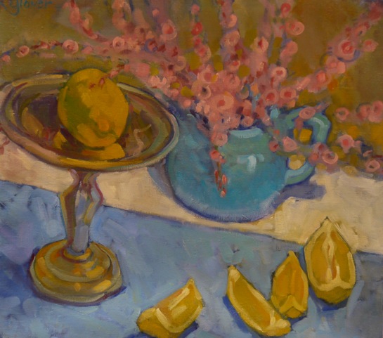
"Sliced Lemon" 18" x 20" oil on linen


Unintentionally I seem to be working with a full palette these days, with a wide spectrum of colors. In the beginning of this painting, I had painted a patterned blue fabric underneath a group of whole lemons. With the planned flowers in the upper canvas, this just did not read well. So I broke the front right space up with cut lemon slices and placed them in an arranged scatter, which works better as a composition. 

Thursday, January 20, 2011

"Transparency" oil on linen


I have been working with clear glass and cobalt glass over the last month or so. I was trying to abstract the design of the red bow. I love the way looking through clear glass distorts objects. The bottle is not painted with precise lines, but then, I wanted it to have it's own personality....like it is breathing.

Tuesday, January 4, 2011

"Dripping Grapes" 10" x 10" oil on linen


I did this painting in the fall. The silver pedestal tray I use in many of my paintings. I wanted the grapes, dripping down, on the left to show their opacity against the light.

Friday, December 24, 2010

"Salt and Kiwi" 10" x 10" oil on linen


I was painting this Roseville baby cup with the kikis and salt shaker. I thought, when through, that the painting looked too symmetrical, so I replaced a kiwi with another salt shaker. Now I really do not like it., but thought that I would show you anyway. What do you think?

Wednesday, December 22, 2010

Flowers


So today I made flowers. This is made with Liberty cotton lawn for the puffy fabric center, hand- felted wool for the petals and a vintage bakelite button in the shape of a cube for the center. I really needed a break from painting. This flower will top off my pile of cookies to my best friend for Christmas.

Tuesday, December 21, 2010

"Maxine" 10" x 10" oil on linen


I've been commissioned to do a few pet portraits over the last year. This is one I just painted for myself of my dog, Maxine. She was a real sweetie! My June 2010 post shows another "Max" I painted for a friend from Facebook. I will soon post the third of an Australian Shepherd. I do work from photographs.

Sunday, December 12, 2010

"About the Glass" oil on linen 18" x 20"


I had mentioned before that I had purchased some pretty blue glass on etsy. The cobalt blue creamer I thought was beautiful in the light. I like the way glass distorts objects viewed through. What I was focusing on in this painting, besides just having it turn out OK, was transparency and opaque, as well as matte and reflective surfaces. I like the fact that in a still- life all of the objects sit still, barring no bumps to the table. Flowers constantly move, people breathe, but, with a consistent light source objects stay put. I use a big black-out cloth for draping my light box, which is set up like the framing of a box, using PVC pipe. Therefore, as the day progresses and the light moves across my studio, I don't have to worry about the light changing. Too bad the present does not contain a reward for all my hard work....just a prop.

Friday, December 10, 2010

"3+4=7" oil on linen 18" x 20"


I have taken an interest in cobalt blue and aqua glass, and with all these tangerines around the house, what a nice compliment in color to paint them together. This is SO obvious, though, that tomorrow I need to find a different color palette to work with. I just found this beautiful little cobalt pitcher on etsy that I want to paint. It's so petite and the light shines through it so beautifully!

Sunday, December 5, 2010

"Joker" colored pencil and ink on bristol

I've always wanted to design a deck of cards. Well, at least the face cards. Do Joker's count? This was just a fun little exercise.

Friday, December 3, 2010

"Cobalt Bottle" 8"x10" oil on linen


When looking for things to set up in a still life, sometimes I am thinking of an "object", while other times I look for colors I want to use. I recently picked up this cobalt blue bottle, thinking orange, orange. I have another blue bottle I am excited about painting, because the shape is just so beautiful.

"Remains of an Egg"


I forgot to post this one with the last. Before I broke this jar in the sink, I did a small painting of the jar after the egg was poured out. Then I broke the jar!      8"x6" oil on panel

Wednesday, December 1, 2010

"Just a Break" 8"x6" oil


Not a lot of time today but I painted this small 8"x6" panel. Egg yolks can look rather funny in clear glass. I accomplished what I set out to do...a quick study. Upon cleaning out the egg from the jar, I, by accident dropped the jar in the sink, eliminating any possibility of painting this jar again. Oops!

Monday, November 29, 2010

"Not My Coffee!" 6"x6" oil on panel


Well, here is little mouse making another appearance and always wanting something. Last time (a few or so posts ago), mouse wanted the last crumb of cookie, being that he was fully submerge in the jar to begin with. Just like my cats, he thinks he wants a sip of my coffee. But I know that he's only after the rich coffee aroma.

Saturday, November 27, 2010

"Pecking" 10"x10" oil on linen


I've never painted glass Christmas balls before, and was having difficulty in choosing the colors, knowing they would be reflecting off each other. Then with the placement, I thought I would separate the two, hopefully getting a wonderful shadow shape to work with. I think the end result looks like big bird eyes with a little beak where the nose would be.


Friday, November 26, 2010

"Hop On" 8"x10" oil on linen


There wasn't even a doubt as to whether I would paint today or go out to do necessary errands. I'm sure the stores were mobbed! Errands can always be held off to another day. So today I was thinking while painting, of making every brushstroke that I put down to really matter, meaning that I wanted to say as much as possible with fewer strokes. I clearly knew what I wanted to say and how I felt about what I saw. The light was beautiful! I just get into this thing sometimes where I think just one more bit of paint will do it. Then again...and again. And before I realize it, I've got a thick mess quickly looking like mud. Well, today I took my time, allowing only so many strokes per square inch...basically. I am a bit more pleased with the results, but I probably would have been better off stopping 30 minutes earlier.

Wednesday, November 24, 2010

"Mug Shot # 2" 20" x 20" oil on linen


This is my second post of this particular painting. Actually, I have a series in the works
 using all of my vintage mixers. I love plastic, especially bakelite, once used in the manufacturing of many items used in the kitchen. I even still have my bakelite Viewmaster with many round slide cartridges in their paper sleeves. Crazy 8 ball! Got that, too! My brownie camera from the 50's still hangs on the mirror in my room. Back to this mixmaster....to me the top, working body looks like a squid when removed from its' stand. Star Wars planet Hoth also previews a droid that hovers over the snow, looking much like my mixer. Anyway, this is my fourth, but not final, interpretation of this nifty appliance. Stay tuned. Look out eBay!


Tuesday, November 23, 2010

"Kids at the Wedding" 42"x42" oil on linen


"Kids at the Wedding" has been a work in progress for the last 3 years. I always seem quick to critique my own work. For me there will always be more issues I could be resolving daily, but there has to be a point when I must stop. Not quit, but stop for awhile. Nuff said! This painting is too big to get into my car, so you are the first to see it, for it has never left my house.

Wednesday, November 17, 2010

"Kiwi" 6" x 6"


This is one of my recent daily paintings. I don't work this small very often, but find that I can pretty much finish a thought or idea in one sitting... and before my subject dries out from the hot lights! I've been working on a lot of holiday things lately and not found enough time to paint and DO IT ALL. Whew! When will I ever catch up?

Wednesday, November 3, 2010

"Oranges Up Front"


I don't have much to say about this one except that I'm glad I took out the eggs and substituted orange slices. I'm having trouble coming up with composition ideas, but by the end of the day I thought that painting foreshortened sliced fruit with a bit of a tweak on the perspective might be fun.