
Sunday, June 27, 2010
"The Narragansett 2"
"The Narragansett"
A few weeks ago I attended a plein air workshop on Block Island with painter Pamela duLong Williams.
The workshop was very helpful in pounding in those academic rules that I tend to forget so easily. One thing I tend to forget after laying in my darks in the beginning, is to go back and re-establish those darks again throughout the painting process, when I tend to let things get a bit muddy. And to keep my darks rich! I also worked on planning my paintings better in the beginning with small thumbnail sketches. This is a thumbnail of "The Narragansett", one of the large hotels on Block Island on the Great Salt Pond.

My first attempt at painting, which is oil on wood panel.

Friday, June 25, 2010
"Just a Nip"

Saturday, June 19, 2010
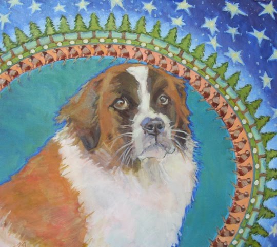
"Max" the dog
Subscribe to:
Comments (Atom)


